Nest
Made for Game Design 1 in order to explore the Bitsy Game engine.
NOTE: There are two endings to be found if you STICK to the right path and collect what's to be found...
Made for Game Design 1 in order to explore the Bitsy Game engine.
NOTE: There are two endings to be found if you STICK to the right path and collect what's to be found...
Comments
Log in with itch.io to leave a comment.
The art here is gorgeous! And with knowing how bitsy works, I know it must've taken a massive amount of time. I think the art and colors really do the game justice in telling this story about change and how a person adapts with it.
I'm having some hard time reconciling in my head what the game is actually about though. The seasons changing really hits home the theme of change and how you react to it. The world and characters are all changing around the player, but you are still focused on finding sticks. But then you come to find out that the dog was still there with you and that you shouldnt be so laser focused on your task as a loved one might be right there in front of you this whole time. This to me doesn't really interact with the theme of "reacting to change" in a very, for lack of a better term, elegant way.
I would personally ditch the seasons altogether. The changing of seasons is such a powerful trope in storytelling that I felt as though I was distracted by it and missed the actual, more interesting, story.
With that being said, the ending really hits the theme of a kind of "stop and smell the roses" vibe really well. As a player, you are always given a goal and all you really think about is achieving that goal. So almost mindlessly playing can be the norm until you are hit with those ending words. I even think the "lame" puns played into that mindlessness as I alomst didn't care what the other animals were saying because all they were going to do is give me a pun. Which, whether intentional or not, also really empowered the ending.
I personally love when a game hits you with an ending and you have to stop and think and ask yourself "did I just play through the entire game and miss out on the entire game?" So you inevitablly play through it again and oggle at all the clues you miseed out on.
So far, this game has been one of my favorites because of the awesome story telling that is simple yet beautiful.
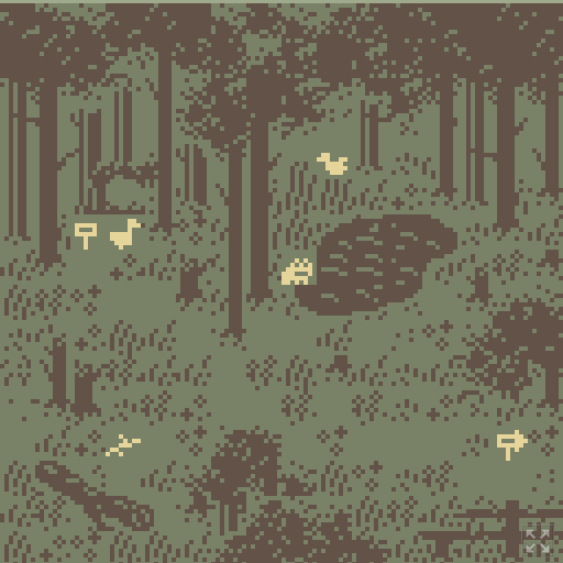
Prompt 2: Nest is a game that uses intricately designed tiles to create its virtual landscape. When asked what objects are given the most attention it is difficult to answer because seemingly every tile in the game is well detailed and thought out. This paints a clear picture in a pixelated virtual world. The composure of the avatars is forcibly much more simplistic than the composure of the background. This is simply a limitation of bitsy, as the tiled backgrounds have more pixels in total than do avatars. This game really takes advantage of increasing resolution through the use of tiles. The use of animation aids the player in better understanding the environment. Animation lets the player feel the wind just by seeing the way the waves move on the pond and the way the tall grass sways back and forth. Animating the animals makes them feel more alive. All of this adds to the immersion of the player. The designer takes advantage of reusing similar tiles throughout the landscape to give a sense of texture. Rather than a plain green background, the player can physically see the grass, bushes, and flowers rather than having to imagine them. Buildings and fences stand out in the natural environment and become a point of focus. The sun off in the distance gives a sense of the time of day and adds to the panic of not being able to build the nest. The color change also gives a sense of the differing times of the seasons and adds to the anxiety of the coming cold season. Overall, the tile design of the game reinforces the feelings of the main character, feelings of worry, and stress as the seasons progress without success.
One of the things that stood out to me when playing through Nest was the use of colors to convey a mood and progression of a story. The game starts out with a green color for the background, which I took as representing the warmth of the summer season. Next the game converts to a blue color, which could represent the end of the day and beginning of a cool night. This subtly tells the player that time is passing between the scenes as well as gives a general tone for the feeling of the world that these characters are living in. The next scene the background is changed to the color red. I took this as representing the season of autumn, where the weather is getting colder in the transition to the winter months and nature is starting to wind down until the next spring. This again is a good indicator of the passage of time you’re experiencing in the world of the game as well as gives you some insight to how these characters in this world are living. In the final scene of the game the color pallet changes to a white color. This to me is representative of the season of winter and the cold and brutal weather that comes with that time of year. As we can see, most of the NPC’s that we have been able to interact with in the rest of the seasons are now missing, presumably due to the cold weather.